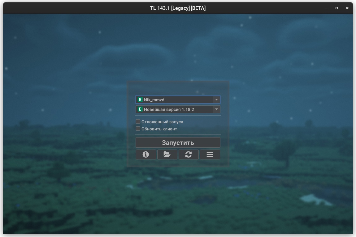
Customization and Themes
This page requires localization of screenshots. Feel free to open a PR if you want to help!
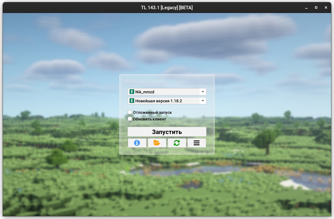
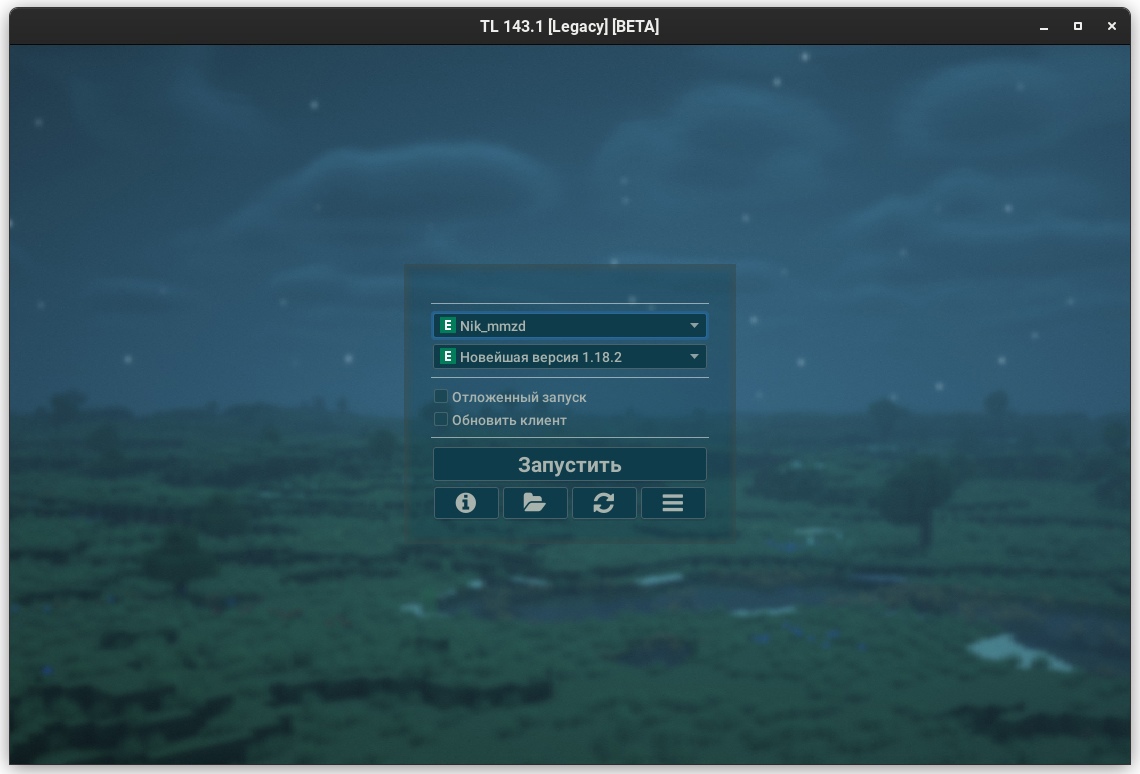
Via Launcher Settings
In the launcher settings you can customize the following elements of the launcher:
- Display notices and ads (check "show notices under login form")
- Launcher language
- Launcher theme (dark, light, automatic)
- Main (login) form position
- Font size
warning
This feature is not recommended for use and will be removed in version 161.0. Consider using HiDPI
- Launcher window size
- Launcher window background (
jpg,pngandmp4are supported)Video-backgroundLegacy Launcher supports video-backgrounds in
mp4format. This functionality requires a Java with JavaFX support. Animated images ingifandanimated pngformats are not supported
Via FlatLaF Themes
FlatLaF themes are supported in Legacy Launcher starting with version 143.0
Embedded Themes
In addition to the standard light and dark themes, intellij (light) and darcula (dark) themes are available.
A special system theme is also available to use the Java system theme.
External FlatLaF Themes
You can create your own FlatLaF theme or use an existing one!
Just download the theme json file and specify the path to it in the launcher configuration file
You can view the available themes and download json files in FlatLaF Demo App.
Want to create a topic on your own? FlatLaF documentation is available for you:
External Theme Setup
- Close the Legacy Launcher
- Open Legacy Launcher configuration file using any text editor (e.g. Notepad++)
tip
Launcher configuration file will most often be located either in the
.tlauncher/legacy.propertiesfolder, or in thetl.propertiesfile in the installer path of the game (.tlauncher/legacy/Minecraft/tl.properties) - Find or create following lines:
gui.laf.v1.flatlaf.light- to replace light themegui.laf.v1.flatlaf.light.ui-properties-file- to apply themepropertiesfile to the light themegui.laf.v1.flatlaf.dark- to replace dark themegui.laf.v1.flatlaf.dark.ui-properties-file- to apply themepropertiesfile to the dark theme
- Specify the desired theme file or settings file path. You can specify the embedded theme name using the
:symbol, e.g.gui.laf.v1.flatlaf.light=:system - Save the file and restart the launcher
Theme Setup Examples
- Darcula
- IntelliJ
- Solarized Light
- Solarized Light High-Contrast
- Solarized Dark
- Material Deep Ocean
Via Legacy Themes
This themes format is designed especially for Legacy Launcher, but allows only partial modification of the interface look and feel. We recommend to use FlatLaF themes
The color scheme is stored in a .properties file with UTF-8 encoding.
You can pass the theme file location either by specifying the path in the settings file in the gui.theme field, or by passing the --theme path argument
Used Types
color- sets a color inRed.Green.Blue[.Alpha]format, e.g.255.255.255.128sets a translucent white color and0.0.0.0- opaque blackint- sets the size in positive integer format (i.e. greater than or equal to 0)enum- indicates that the field can only accept the specified values (or none)mixed- field can take several types of values from those described above
Theme File Syntax
| Ключ | Тип | Описание |
|---|---|---|
foreground | color | Foreground color (text) color |
background | color | Background color (background in text fields) |
semiforeground | color | Color of the placeholder text (tooltips in text fields) |
panelbackground | color | Panels color (login form, settings, etc.) |
success | color | Permissive color (dark green by default) |
failure | color | Prohibition color (dark red by default) |
border | color | Default panel border color |
border.size | int | Size of the outer borders панелей |
shadow | mixed: (color, enum: border) | Specifies the color of the inner shadow. If border is set, the initial color of the inner shadow defaults to the panel border color |
icon.defaultColor | color | Default icon color |
icon.color.<icon-name> | color | Icon icon-name (e.g. icon.color.refresh) |
border.<panel> | color | Border color of the specified panel type |
shadow.<panel> | color | Initial shadow color of the specified panel type |
arc.<panel> | int | Boundary curvature radius of the specified panel type |
Available panel types:
main_panel- represents the main panels (login form, authorization forms)additional_panel- represents additional panels ("Preferences", login form prompts)settings_panel- presents the inner panel in the settings panel
Examples
foreground=0.0.0
background=255.255.255
panelbackground=255.255.255.64
shadow=0.0.0.0
arc=16
# This theme replicates the old Legacy Launcher panel design
border=28.128.28.255
border.size=2
arc=32
shadow=0.0.0.0
panelbackground=255.255.255.168
border.main_panel=28.128.28.255
border.additional_panel=28.128.28.255
border.settings_panel=28.128.28.255